Optimize APL Lifecycles
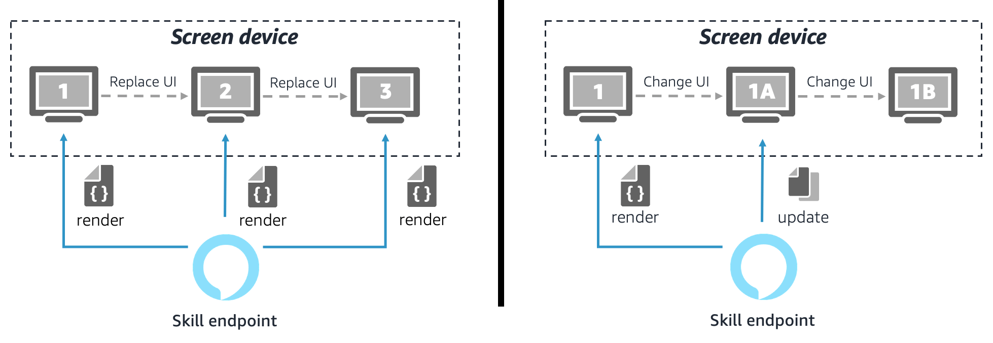
If you want to reduce latency and improve the visual UX, you should, in most cases, use an already rendered APL document and update its UI on screen and avoid replacing the UI by rendering an entirely new APL document for three reasons:
- Rendering new APL documents always requires additional resources and operations in the cloud and on the device side. The time it takes to render a lightweight APL template is still higher than latency that is introduced when you re-use an already rendered APL document.
- Replacing the UI by rendering a new APL document leaves you with no effective way to customize visual screen transitions to make them appear more seamless.
- Rendering new APL documents resets the local data context and viewport state. Not being able to preserve state information locally on the device would require your skill to persist session-based information and send relevant information back to each newly rendered APL document.
The below diagram illustrates two scenarios. One in which the skill keeps rendering new APL documents for each user interaction step and another in which it updates an already rendered APL document on screen.
Under the following circumstances, you might not be able to reuse an already rendered APL document:
- When you cover an entire experience from start to finish, your APL template needs to be highly dynamic, and can easily become a lot more complex and large in size.
- Due to the expected complexity of the APL template, the initial rendering of the screen upon skill launch might cause latency to be significantly higher, and general performance might decrease.
- In some scenarios, rendered APL components' appearance or content changes fundamentally as users progress through your APL experience. For instance, if your APL experience is backed by complex data structures that update frequently, it might become challenging for you to reflect those data changes and update the UI accordingly. In this instance, it might be more efficient for you to render a new APL document.
In reality, there’s no strict rule about whether you should always replace or reuse rendered APL documents. There are situations where you might have a mix of both:
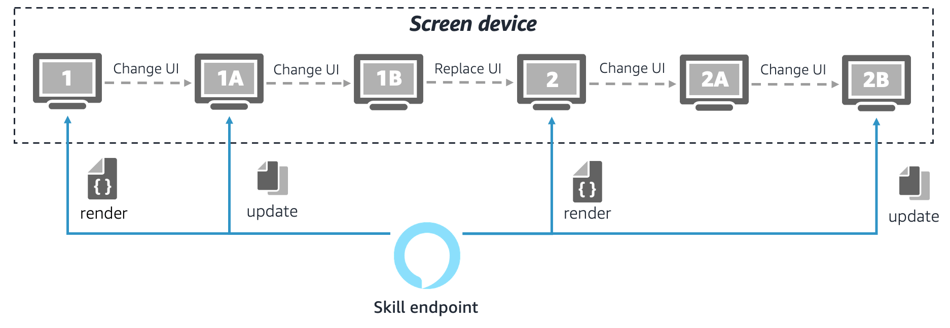
You should avoid unnecessary APL document renderings as long as the major benefit of having a seamless UX at skill launch outweighs the cost of having a larger APL document with a potentially higher initial-rendering latency.
Design APL interaction flows
Deciding on when to render a new APL document versus reusing an already rendered document by updating its content and dependent UI elements — either from the cloud or locally from the device — is one of the important decisions to make when planning your APL project. Because it has a significant impact on how you build your templates and set up your project, you should spend some time finding the optimal APL experience lifecycle. The best way to do this is to start from your actual use case and your envisioned multimodal user experience.
Similar to how you design dialog-based voice experiences for skills so that you can define intents and slots to build the skills language model, you can design multimodal APL experiences by considering interaction flows that describe how users walk through the experience. As a result, you get a better understanding of how to best divide up an entire visual UI experience into APL templates, how to organize and structure them internally, and when and how to render them again or update them over time.
You can design APL interaction flows by using the following four-step process:
- Step 1: Identify visual user flows
- Step 2: Identify data flows
- Step 3: Gather requirements for screen navigation and transitions
- Step 4: Complete your plan
Step 1: Identify visual user flows
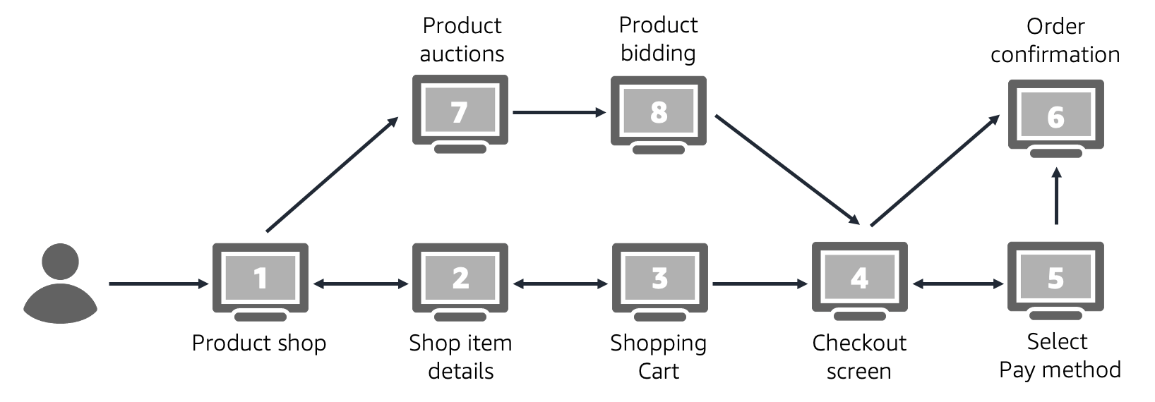
The first step in designing APL interaction flows, is to identify the distinct visual user interfaces that are contained in your APL experience. Define a set of happy paths that users would take to progress through the experience.
The below example visualizes potential user paths in an APL experience that consists of eight individual UI screens. Users can navigate through these interfaces in various ways and the arrows intend to draw the supported user paths.
If you already have a voice-only skill that you want to extend with a multimodal experience, you might want to reuse design artifacts, such as a voice user interface (VUI) diagram or the list of skill intents, to work out common user paths that your visual APL experience will also need to have. Likewise, if your plan is to migrate an existing visual experience of mobile app or web interface, it makes sense to take over their visual user flows for your APL project.
Step 2: Identify data flows
Besides logical user flows that describe your visual APL experience, there usually is data that goes along with the flow. This data is then consumed and displayed on the screen. Consider what and when data is needed in each of the steps of your visual user flow. Also, consider all the data-providing sources, such as a database, a web service, or user input that is captured from the screen itself. The following diagram shows an example of a simplified visualization of a data flow.
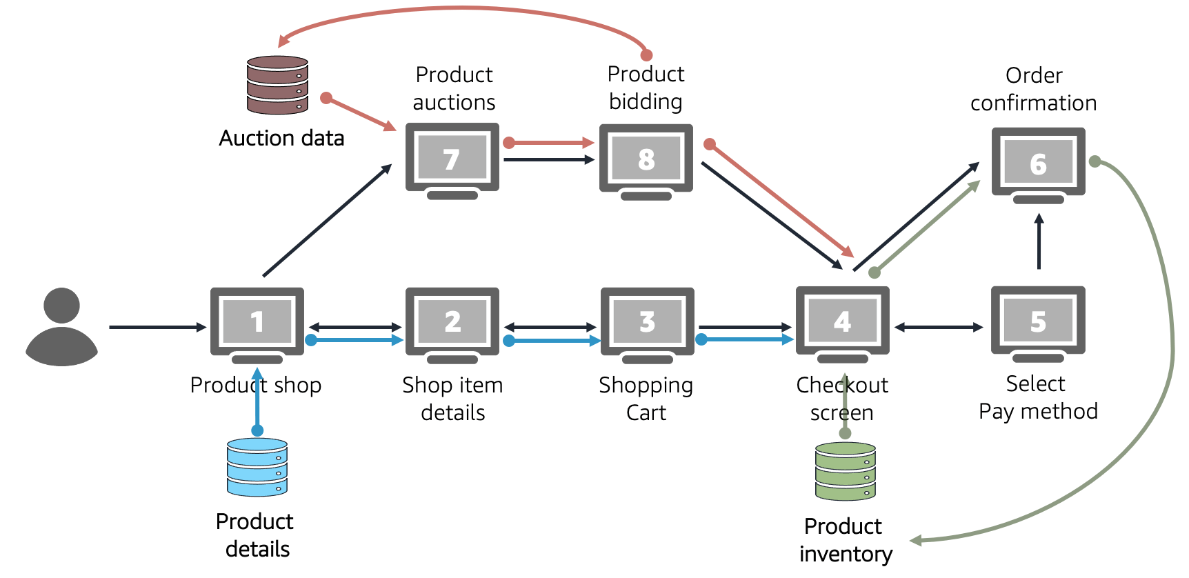
At this point it can help if you create a basic idea of how individual user interfaces will look so that you know what type of data is required to be seen and processed on screen, and what data you expect to gather as input from the user or the device. If you haven’t already done this exercise as part of identifying the visual user flows, imagining or sketching visual UI screens can lead to a better understanding of what is required as input and output data.
Step 3: Gather requirements for screen navigation and transitions
Visual user flows can be much more dynamic than voice user flows. Also, visual user flows aren’t as sequential as voice user flows. When you consider how your users move back and forth between screens and toggle between different view modes, you might find that some areas of your UI are more cohesive than others. Apply the following best practices to make sure that your UI sticks together where appropriate:
- Make switching between related screens a seamless experience with low latency and fluent visual transition. For example, a list item detail UI should support seamless and quick back and forth navigation between the list view and the item detail pages.
- Keep related UI areas in a consistent state to each other. For example, these interfaces should be able to have shared data that they visualize in different ways. When shared data updates, the UI should change automatically and without noticeable delay.
Try to reflect screen navigation and transition requirements by grouping closely related user interfaces to form cohesive units. Also consider shared data sources and dependencies to determine the grouping of UI screens. Group these screens by anticipating data flows in your APL experience. The following diagram shows an APL user flow with eight UI screens that's divided into three groups.
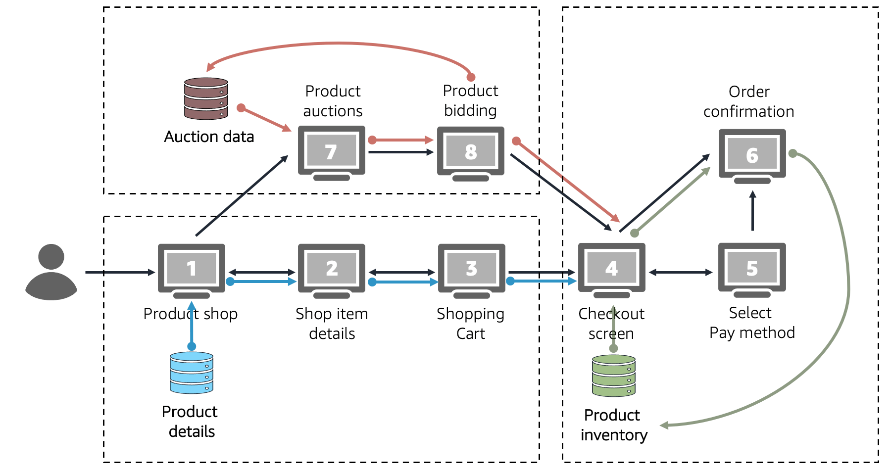
Step 4: Complete your plan
The previous steps organized your APL experience into cohesive groups of UI screens by identifying and combining visual user flows, corresponding data flows, and high level UX requirements related to screen navigation. This structure helps you to create an APL lifecycle that covers fundamental requirements in your APL project if you assume that each UI group is rendered as its own self-contained APL document.
As a last step, take all these inputs to illustrate an anticipated lifecycle that covers the most common visual user paths in your APL experience. The following diagram is an example of an APL experience.
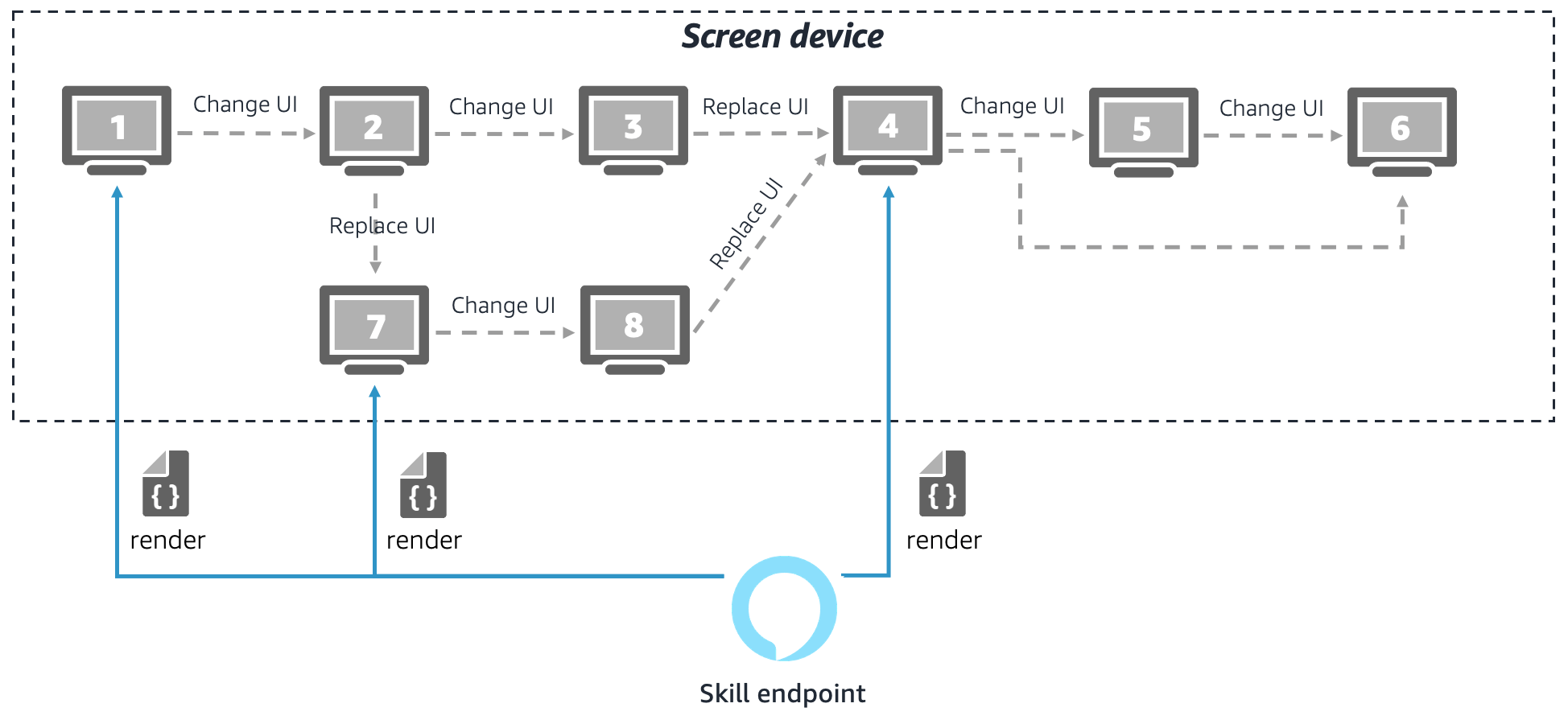
As a result, your visualized APL experience helps you answer the following key planning questions:
- What key artifacts — APL documents — should your project have to create the APL experience you want? In this example there are three APL documents to create.
-
What visual user interfaces should become part of the APL experience and how are they connected? This example identifies eight individual user interfaces that are lined up in a way to support the user paths you want.
- When and how do you want to transition between the user interfaces? This question goes back to the key decision that has to be made by an skill or an APL document on screen for each user step. The decision is whether to replace the UI by rendering a new APL document or by updating the UI of an already rendered APL document. It is important to find an optimal approach because continuously rendering new APL documents can affect performance and UX quality of your APL experience. For details, see Understand APL Lifecycles.
You should always review and evaluate your visualized APL lifecycles by answering the following questions:
- Does this properly cover my functional user requirements?
- Is this going to be technically feasible to build?
- Does this make efficient use of APL in terms of the number of screens being rendered versus updated?
If you cannot answer “Yes” to all of these questions, you can still iterate on your interaction flow design to address your concerns. For example, you can rethink and change your user and data flows in a way that enables you to regroup UI screens into APL documents more efficiently. Don't worry if you aren’t yet confident enough to answer these questions decisively. In fact, your APL lifecycle can change later, when you design your document templates and build out the APL experience. For instance, you might find an opportunity to merge two APL documents into one; or you might need to split up an APL document due to a technical constraint that you had not thought about initially.
Related topics
Last updated: Nov 28, 2023